Your users become your eyes on the trails
Your trails are ridden every day by people who are not on your crew. When a tree comes down across a descent on a Tuesday morning, somebody saw it — and you will hear about it the following Saturday, in a Facebook comment buried under thirty others, or never.
What was missing was never their goodwill. It was the path: create an account, remember a password, find the right page. Nobody does that standing in a trail with a bike in their hands.
Sentinel 3.0.0 opens up public reports. The user opens the app, takes a photo, sends. No account, no email address, no password. You receive the report with its location and its photo, in an inbox to be triaged — never straight into your planning.
One photo, one location, and that's enough — The submission screen asks for a photo, and that is the only thing required. The location goes on its own from the GPS, the description and the first name stay optional, and the user is never asked what kind of problem it is. Making them choose between "erosion", "drainage" and "structure" is asking them to do your classification work: they will choose wrong, and that will cost you more time than asking nothing at all. With no signal, the report is queued on the device — "Saved on your device" — and leaves as soon as coverage comes back. Deep in a trail, that is the normal case, not an edge case.
The user picks neither the network nor the trail — The QR code on the trailhead sign is the normal path, and the only one that works with no cellular signal: the code travels inside the address, there is nothing to look up. Then comes the six-character code printed under the QR, for when the camera will not cooperate, and the location, which offers up the networks nearby. As for the trail, it is never asked: a user does not know your names, and sending them hunting through a list of thirty-four tracks means losing the report. The match is computed on arrival, from the distance to the track, and it is offered to you at triage — to confirm, to correct, or to leave unmatched.
A report is not a task — This is the decision everything else follows from. Reports land in a separate inbox, and nothing enters your planning until someone on your crew has decided so. If every submission became a task, your board would fill up with duplicates, false positives and problems already fixed, and your indicators along with it. An inbox gets emptied; a polluted task board never really gets cleaned up.
Three outcomes, and a form already filled in — "Create the task" opens your usual form, pre-filled with the location, the trail, the activity, the description and the report's photos; you add the type and the priority — what the public did not tell you. "Attach to an existing task" is often the right move — somebody is reporting a problem you already know about — and the photos go on to enrich that task. "Reject" takes a reason that you can choose to share; do share it, since one "this trail isn't ours" saves you the next five reports. Full triage exists on the phone too, with the same outcomes: on site you are standing in front of the problem, which is often where the call is easiest.
What repeats gets grouped — A tree across a busy trail gets reported three times before noon. When you create a task or attach one, the app shows you the reports waiting in the same spot — within 40 m, less than 72 h old, not yet triaged — and lets you tick the ones describing the same problem. Nothing is ever pre-checked: two reports twenty metres apart can be a fallen tree and a rock in the descent, and a neighbour included by mistake will receive "work is planned" then "it's fixed" for a problem that is not. The cost of that mistake is carried by a user, not by you. When there is no neighbour, the screen never appears.
Nobody is left without an answer — This is what decides whether a user reports a second time. From My reports they follow theirs across four steps — received, accepted, in progress, resolved — and they can ask to be told when it moves. Attach it to a task that is already finished and they learn it was already fixed: that is an answer, not silence. Refuse it and share the reason, and they read it. These notices stay deliberately thin — they see where their own report stands, never your planning, your assignments or your discussions, and never the trail you settled on. What they get is the certainty that somebody looked.
Nothing opens without you — The feature is off by default. A single page decides everything: whether reports are accepted at all, whether the photo is required, whether the first name is asked for, how many submissions one device can send per day, and what the public may consult — the map of your trails, your published conditions, or nothing at all. How you get found has three settings: By invitation, your code and nothing else; Found on site, offered to whoever opens the app near your trails; Listed, findable by name from anywhere. Start on invitation while you see the volume — widening is easier than pulling back. The required photo is worth keeping: "there's a tree" tells you neither the size, nor whether a handsaw will do, nor whether it takes two people.
Seeing them arrive and deciding are two rights — A volunteer can watch the inbox without being able to rule on anything, and a lead can triage without being able to change how open your network is. New reports get their own tab in the notification centre, with three channels to choose from — email, push, and in-app — and only the members who can triage are notified. The dashboard counts reports received, closed and refused over the period: the ratio between the last two tells you whether your users are reporting off-target, and often why.
None of this is a box ticked on a feature list. The required photo, the separate inbox, the empty checkbox when grouping, the silence about the trail you settled on: every detail answers the same question — does it save the crew time without costing the trust of the person who stopped to report? A network that opens this door gains eyes on its trails, every day, with nobody put on the payroll. And the user who takes it stops being a stranger complaining: what they report counts, and they get to see what becomes of it. That is what makes both sides do it again.
The details are in two articles: receiving public reports for opening up, the settings and what the user sees, and triaging public reports for the inbox, the three outcomes and grouping.
Your structures name themselves
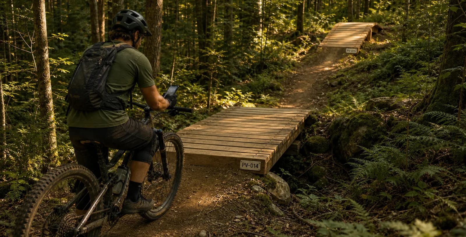
Out in the field, whoever installs the thirtieth marker on a trail shouldn't have to decide what it's called. Until now,
every structure name was typed by hand — with everything that comes with it: PV 12 sitting next to PV-012, skipped
numbers, and duplicates you only discover three months later while preparing an inspection.
Sentinel 3.0.0 brings automatic structure numbering. You describe the shape of the name once, and the app proposes the next one every time you create a structure — at the office as much as in the field, with or without a connection.
One rule per type and per activity — Structure types now have a Numbering tab: a prefix (PV, BRIDGE, DR…),
a separator, and the number of digits. A live preview shows the next three names. A boardwalk for mountain biking and a
boardwalk for hiking stay two independent sequences, with their own prefixes if that's what you want.
One sequence per trail — Numbering restarts at 1 on every trail: the first boardwalk on one trail is PV-001, and
so is the first boardwalk on the next. Off-trail structures form their own sequence. It matches the way people talk on
the ground — "the second boardwalk on La Coulée", not "boardwalk number 47 on the network".
No counter to maintain — Sentinel keeps no counter: on each creation it reads the names already in place and
proposes the next one. A deleted number is therefore reused, with no permanent gap. And the sequence picks up from what you
already have: if your structures are named Bridge 12 and Bridge 13, the next one is proposed as Bridge 14, even
without any rule configured. A rule is there to impose a shape, not to turn the mechanism on.
The name is still yours — It arrives pre-filled, never imposed. You can replace it with anything you like; the app simply warns you if that name is already taken on the same trail.
Even deep in the woods — Offline, the proposal accounts for the structures already on the device and for the ones waiting to be synchronized. Two boardwalks created back to back in the same area can't end up with the same number.
Numbering is configured from the web app, and mobile uses your rules as they are. The details — prefixes, separators, scope, edge cases — are covered in the structure types documentation.
The trail you tap finally stands out
On the Field map, tapping a track filters tasks down to that trail. That was already true — but nothing really showed it: the chosen trail got a halo in its own colour, so pale green under a green line, in the middle of fifty other coloured tracks. You tapped, something changed, and you weren't sure what.
The other trails recede — As soon as a trail is selected, every other one drops into the background, very pale, names faded, while yours thickens. Nothing disappears: you keep the shape of the network in view. The contrast comes from recession rather than from adding a colour, which makes it read just as well on satellite as on the light basemap.
The phone confirms — A short buzz when the track is caught, the same as for tasks and structures. Aim for the line: a trail's touch area is narrower than a marker's.
A pill tells you what you're filtering on — Zoomed in on a task, the chosen track no longer fits on screen. A pill at the top left names it. And when it's the very trail you're walking, it replaces "You are in" rather than stacking under it: the same name is never written twice.
If you filter several — The display changes character instead of piling up. A quieter dark capsule shows the symbols of the ratings present in your filter, then the count: "10 trails filtered". It stays the same size whether you filter two trails or fifteen.
Tap the same trail again to go back to the full view. It's the same filter as the panel's: what you set with your finger on the map shows up under "Trail", and the reverse holds too. The details are in the mobile map documentation.
Your task folders reach the phone
Folders group the tasks that get done together — "May 12 work party", "Before opening day". You filled them from the web app, but the phone never showed them: out in the field you had to piece the work party back together from memory, task by task, in the middle of the whole list. The tidying done at the office stopped at the door.
Sentinel 3.0.0 shows your folders in the Field list, and lets you open the contents of each one.
A Folders heading, between the projects and the tasks — One row per folder: its name, an arrow, and a gold folder icon. The drawing is the same as a project's; colour is what tells them apart, gold for a folder and grey for a project. A project also shows its task count and its progress — a folder carries nothing but its name.
Three ways to look at it — Tap a folder and its contents open like a project's: Map, List and Kanban, as three tabs at the bottom of the screen. The map frames itself on the folder's tasks, and the kanban is the one you know from My planning — one column per status, drag-and-drop to move work along.
Every folder reopens the way you left it — The mode is remembered folder by folder, not once for all: a scouting folder can reopen on the map while a work-party folder reopens as a kanban. The kanban goes further and remembers the column you were on as well. A project's details now behave the same way.
A shortcut, not a drawer that hides things — Filing a task in a folder doesn't remove it from the list: it stays visible further down, in its status group. A folder opens a second path to the same tasks, it diverts none of them.
Even with no network — Folders are part of the data installed on the device, like the trails and the task types. The heading shows up and a folder's contents can be browsed offline, with nothing to prepare.
Inside a folder you see the whole folder: the filters in the top bar don't apply there, so you never get an empty list with no visible reason for it. The details are in the mobile list documentation.